Today’s post will be about the design principle of alignment. New designers often violate this design principle by putting text and graphics on the page wherever there happens to be room. Often this can leave a layout looking unorganized and unprofessional. By aligning objects, you can give your pages and designs a feeling of harmonious visual appeal.
The principle of alignment states that nothing should be placed on the page arbitrarily. Everything on a page should have a visual connection with something else. Following this foundation forces you to be conscious about the decisions you make.
Have a look at the photo below. This is my coffee table with several random items on it. Although each item is separate and distinct; your mind is trying to connect them into a cohesive relationship. Because there is no pattern of alignment, individual elements fight with the overall composition.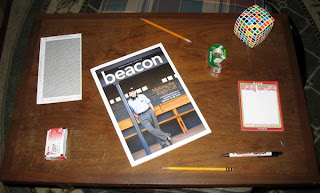
Now, when we give an alignment pattern to everything, look how organized the layout becomes. Your mind can quickly group things with a common boundary. Even when new things are added, we can quickly understand where they should go. Creating an alignment scheme is often the first step in building your design.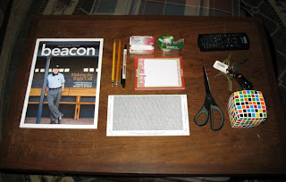
Business cards are a great exercise in alignment and information display. Many times I’ve been given cards like the one on the left. Amateur designers will try to fill up white space by throwing each item into an open area. In this little space, we can see three different alignment patterns (flush left, flush right, and centered). None of the elements are connected. However, by moving all the text to the right, everything becomes instantly organized. The power of this edge is what gives strength to the layout.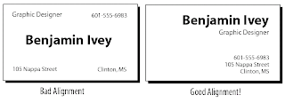
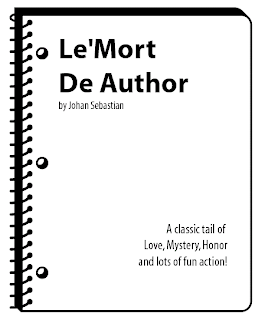
I don’t want to sound like using two different alignments is a bad thing. Alignment can be a vehicle to adding contrast. In this design, I am adding contract between the title and subtitle by using two dramatically different alignment schemes (flush left and flush right). As long as the elements are not similar, then this technique will work.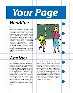 When making a layout, think of your page as a grid with vertical and horizontal guides along each element. Most design software such as Photoshop, Quark, and Illustrator offer the ability to make alignment guides and grids. If you can’t create alignment guides, then use existing items on the page. This is achieved by either aligning baselines of block text, or the edges of graphic elements.
Here’s a final example of what I mean by having a strong alignment line. In the example below we have a heading, body of text, and a picture. With the heading centered, and the body of text flush left, you can tell that I’m not very pleased with this layout. To fix this, I’m going to use the strong vertical alignment of the picture to line up my text.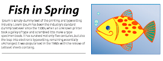 Doing this alleviates the awkward white space trapped between the text and picture. This simple design is stronger because all the elements are aligned along the same edge. Everything is cohesive an your mind is left with the sense that the text is associated with the picture.
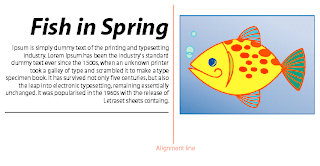 So, here’s my concussion and final thoughts… Remember that the purpose of alignment is to unify and organize your page. To make all the elements appear unified, find a strong visual alignment and stick with it. Don’t use too many alignment schemes on one page. And, most importantly, be conscious of where you place things on your layout.
In my next post, I will show you how repetition can give you designs a good reputation.
That’s all for today. You be good!
--Ben
Today’s post will be the first in a series on four basic principals of good design. I call these the “Basic Principles” because they are the foundation of how all good designs should look. These four foundational principles are: Contrast, Repetition, Alignment, and Proximity. Although I will be talking about each principle separately, keep in mind that each are interconnected, and no single one holds more weight than the others.
First, I must caution you… You are about learn something.
For today, I will only tackle the principle of Contrast. Contrast is one of the most powerful ways to add visual appeal to your design. If your page is striking, a reader will want to look at it longer.
Creating contrast is simple, all you have to do is make two elements look different. The rule to contrast states that if two items on a page are not exactly the same, then make them different. Really different! We are all accustomed to using Bold, Italics, and Underlining to make elements of our page stand out. I’m going to show you how to kick it up a notch!
First, have a look at the two résumés below. The one on the left is fairly typical of all the résumés I’ve seen. The information is there, and if someone really wants to read it, then they will. But nothing is grabbing my attention. The one on the right, however, is more attractive. You don’t have to read the text to know how its organized and where all the visual cues are. This is the power of having striking contrast with the elements on a page.
Next, Look at the example below. Perhaps you have seen some ads like the one? When I see this, the first question I ask is, “what is my eye drawn to?” This design has poor contrast because all the elements have similar size, weight, and importance. Visually, your eyes have nothing to focus on because everything is competing for your attention, and nothing is winning.
Now, look at this example. I decided to focus my attention on what is most important – the name and phone number. I made these elements the largest and boldest; everything else is drastically smaller. This gives good contrast and draws your eyes into the design. Once the reader is pulled into a focal point, they will read the smaller print.
A final way to add interest through contrast is to use the technique of Reverse Type. Instead of the usual Black-on-White lettering, reverse type means putting light letters on a dark background. In keeping with my previous design. I will add some punch to the heading of my ad by reversing out the type. *Note: Do NOT use this on every element you want to stand out. Use reverse type for the most important areas ONLY.
Contrast is the most fun of the deign principles because it is so dramatic. Remember, the idea is to avoid making elements on the page appear merely similar. Be DRAMATIC with your contrast. A few simple changes can yield eye-catching results.
In my next post, I will teach you about alignment and how placement can connect all the elements on your page.
That’s all for today. You be good!
--Ben
qwf5yns3tz
There are many aspects of being a graphic designer/artist that I must deal with every day. Consistently, however, it always seems like the simplest details become the things I dread so much. Today’s post I will talk about one aspect that really sets me off – The naming of colors!
When I was young, colors were simple. I was never one of the kids with the 64+ box of crayons. No, my color palette was usually limited to the 24, well named, and often unorganized box of colors. It’s pretty easy to name 24 colors; Brown, blue, green, yellow, etc… From those, you can get lighter and darker variations: Light brown, dark blue, yellow-green, and so on. I enjoyed these colors names because they told me exactly what color I was picking up. A “yellow-green” crayon would predictably give me a greenish color with the hint of yellow. A “Light Brown” would yield a tint of brown. Yes, when I was young, the world was my oyster and colors were simple.
Then I realized there were color names that didn’t make too much sense; yet were universally accepted, so I went with it. Such colors are Pink, Mauve, Turquoise, or Maroon. These didn’t fit my normal vocabulary because I had no idea was a “mauve” was, and had never seen a stone of turquoise. But I accepted them and allowed them into my crayon box. After all, these colors were accepted because everyone agreed that “pink” mean light red, or “maroon” meant dark redish-brown.
As I grew up, life became complicated. Everything about life can be complicated, even its colors.
When I finally got my hands on a big box of crayons, I eagerly looked at this plethora of hue options. “Wow,” I thought, “what are their names?” To my disbelief, I realized that the Crayola company seemed to have lost its mind – or at least its sense of reasoning. Rather than describing their colors in a thoughtful and scientific manner, the new colors were given descriptive names from objects that resembled their colors. So, instead of a “light yellow-green” we had “Lime.” Instead of “dark red with hint of blue” we had “Cherry.” Or instead of “Light blue” there was now “Robin’s egg.”
What’s disgusts me about this is not the clever and imaginative use of adjectives; it’s the widespread use of this practice into the industrial world. Pick up any fashion catalog and you are immediately bombarded with passionate adjectives that describe the emotion of their products, yet fail to deliver hard facts. “Deep Forest”, “Sunset”, “Midnight”, “Passion” are all words I’ve seen used to describe the color Blue! I find myself yelling at the magazine “Just say it’s Dark Blue! Don’t make me think!”
The worst color descriptions happen when being associated with foods. A client once instructed me to, “Make a shirt design using ‘chocolate brown.” Immediately, I responded to them, “Do you mean ‘Dark chocolate’, ‘milk chocolate’, ‘white chocolate’, or something in between?”
Chocolate is food, not a color! The same holds for Pistachio, Lime, Aqua, Bannana, and Avocado.
So here’s my advise and conclusion: If you’re going to be picky about colors, please be sure to use good, scientific, and thoughtful descriptive words. If necessary, find a picture of what you’re looking for. I can understand “Starbucks green” because there is only one green in their logo! I can understand, “Dark red with a hint of blue” because that’s being specific. What I can not understand is why people must waste my time describing a color that is ultimately left up to my subjective interpretation.
That’s all for my rant right now. Does anyone else agree or disagree?
Be good!
--Ben
Here’s a common problem recently faced by one of my friends while using PowerPoint. In the image below, there are two pictures on one slide. The one of the left has a white boarder around it, while the other is transparent. How do you get the transparency?
It turns out that not all images are made the same. The image on the left is a common “.Jpeg” file. Though it’s a complex process, a Jpeg file manages to save almost all colors visible to the human eye (which are in the millions). The image on the right is a “.Gif” file. Gif images were designed especially for internet use and can have up to 256 colors. As a result, this file format is usually smaller and of lower quality.
The important difference is that Gif files support a “transparent” color. That is why the image on the right has no white background. It’s background “color” is null. Other file formats that support transparency are “.EPS” and “.PNG” I must emphasize that you can not simply "get rid of the white" - it must be converted to "transparent.
Making these in Photoshop is actually quite simple. Simply remove your background layer from the Layers palette. Or, if your image is on the background layer, copy your image to a Transparent layer, then remove the background. Just be sure that you can see the gray checkered background design before saving the image.

I prefer to use the “Save for Web” feature in Photoshop, because it gives me an idea of the quality my saved image will have. You may also use the “Save As” option and select any format you wish. Just be sure the “Save Transparency” box is selected.
Fun fact for today – JPEG stands for “Joint Photographic Experts Group” which is the name of the committee that created the standard file format type.
Y'all stay cool this summer!
--Ben
Here is another hopefully beneficial tutorial for those who have ever used Photoshop. Today I’m going to show you how to create your own brushes and brush effects in Photoshop. You can do a quick Google search for “Photoshop Brushes” and get thousands of websites that allow you to download (for free or pay) various brush sets. Hopefully, by the end of this blog, you’ll be able to save yourself some money by being able to make your own brushes.
First off, lets do a simple set up. Open a new document with a white background. For the sake of simplicity let’s keep this document in Grayscale mode. (Though you can always use any other color mode).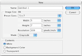
Take a small brush and do a simple doodle with it. Doesn’t have to be anything spectacular. Next, use the Rectangular Marquee tool to select the drawn image.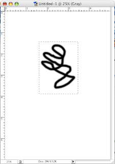
With the doodle selected, select Define Brush from the Edit menu in your menu toolbar. When prompted, give your new brush a name. Click OK.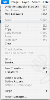

Now when you select your Brush tool, this new brush can be found in the Brush Menu bar. Select it.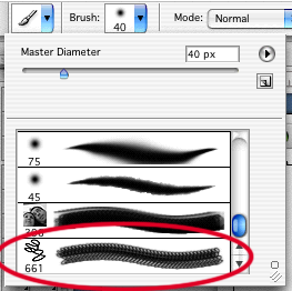
Now you can stamp and move this design all over your canvas. If you want you can even change the master size.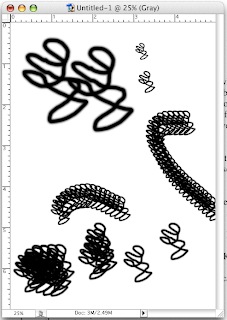
OK, so that’s a simple use. Now lets get a little more fancy.
Open up a picture and convert it to Grayscale. Using the same steps as above, select an area and make it into a brush.
Now when you select this brush, it will look exactly like the area you selected… shading and all! Play around with the size and change up the colors. This is a fast and easy way to stamp out a design in Photoshop. No hassle with creating a new layer for each image.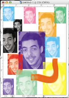
So what is the professional use for this feature? Many pro Photoshopers will take pictures of different textures, drawings, and patterns. Then scan them in and make one-of-a-kind blending brushes and pattern stamps. These type brushes save on time and can give your artwork a natural look and feel. An excellent photoshop painter is Craig Mullins. Check out his website for some great inspiration.
Some patterns I would recommend taking pictures of are: Clouds, Wood grains, Trees and bushes, liquid spills and drips, light reflections, holes, scrapes, and pencil drawings. Below are some examples from my archive.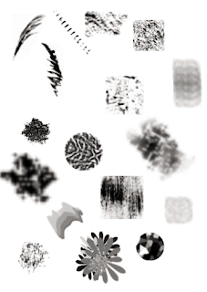
That’s all for today. If you have any questions, please feel free to give me a shoutout.
--Ben

What’s the difference between CMYK and RGB color modes?
This is a common question faced by new digital designers and those that have ever worked with a printing company. Though there’s a lot of science involved, I’m primarily going to stick with a general answer.
First, let me flex my art-nerd muscles…
When you were in school, you probably learned that mixing colors like Red and Blue will give you a different color (Purple). Artists have known this for centuries, and dubbed this “Subtractive color mixing”. The “Subtractive” part comes from the fact that adding colors will absorb wavelengths of light and reflect others. Mixing the primary colors of Red, Blue, and Yellow can yield just about every color in the spectrum. If we throw in black and white, then you can get tints and shades of those colors.
CMYK acts in the same manner. The colors of Cyan, Magenta, Yellow and Black are the least number of colors printers can use to give you the most range of colors. Therefore, when you want to have something printed, be sure it’s in CMYK color mode. If you happen to have a magnifier handy, look at a color picture in the newspaper. You'll be able to see each individual dot of color ink.
In the last few centuries, scientists have understood light and how it can be broken into different wavelengths. A fun science experiment is to get three flashlights and cover each with a Red, Green, and Blue transparent film. If you go into a dark room and shine the spotlights onto a wall, the colors will mix together. Instead of becoming darker, the colors actually become lighter! This principal is known as “Additive Light mixing.” (As a side note, look up the work of James Clerk Maxwell. It’ll blow your mind.)
If you get real close to your computer or TV screen, you’ll notice that there are thousands of little Red, Green, and Blue dots. Those screens are emitting light, the same way the flashlights are. It just so happens that Red, Green, and Blue are the least number of colors needed to produce the entire spectrum of colors. Changing the intensity of each will give you tints and shades of each color. When you are creating a document for the web or TV, make sure it’s in RGB mode. Most scanned images are automatically in RGB mode.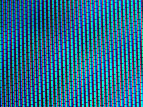
The thing to remember is that if you ever create a document in RGB, then convert it to CMYK, some of your colors will automatically become dull. This happens because a computer screen can “mix” more colors than a CMYK printer. The image below shows how drastically different an RGB blue would print on a CMYK printer.
Additionally, if your screen colors and your print colors are WAY off, then you may need to calibrate your monitor and printer. This can be done with software and special devices called Monitor or Gamma calibrators. TIP – in Photoshop, if you ever see a little triangle alert symbol next to your color swatch; that means you’ve picked a color outside the CMYK gamut. Clicking on the symbol will automatically correct it for CMYK.
That’s all for today. Thanks for everyone who comments! I hope to have more tutorials up soon.
--Ben
So to kick things off, I wanted to start with a little tutorial of something I’ve had to do a lot of as a graphic designer – color separations.
This process will show you how to color separate vector art using only Adobe Illustrator. It’s a quick and easy process that has always given me great results for screen printing. You can use this process for as many colors as you like. Just be sure to follow each step closely.
To begin, I want to note that this process will only work for artwork that has “flat colors.” There are no gradations, tints, or transparent colors. Perhaps in a later post I’ll show you how to do those using a process in Photoshop.
This will be our setup image. When I make a tshirt design, I always start with a background color that’s the same as I want my shirt to be. In this case it will be Orange. The image is a two-color print (Blue and Black). It’s very important to make a swatch of the colors you use; and only use those colors. I like to pick from the Pantone swatch palette; that way I can tell the printer exactly what color number to print.
First, make sure all aspects of your image are unlocked and select your entire image. In your Menu bar select: Object – Expand… Check the Fill and Stroke boxes and hit OK. You have now turned all your stroke paths into fill paths. If you look in the color selector’s at the bottom of your tools palette, you should see a question mark for the fill and a null for stroke color.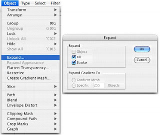
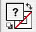
Deselect the image and pick up your Direct Selection tool (aka ‘The White Arrow”). With this tool, click on a single area of color. In my case I chose the Blue area.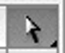
Next, in the Menu palette, go to Select – Same – Fill Color. This selects all the colors on your image that have the same fill color selected.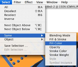
Now we can Save this selection. Go to Select – Save Selection… When prompted, give the selection a color name. In my case I’m calling it “Blue Layer” (original, I know). Repeat this step for each color of the design – including the shirt color!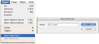
When you’re done, you can see each saved selection under the Select menu.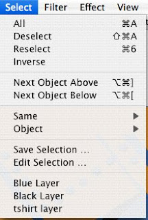
Next, with your circle and line tool, make some simple alignment marks at the corner of your image. They don’t have to be too big. When done, Group each of them together.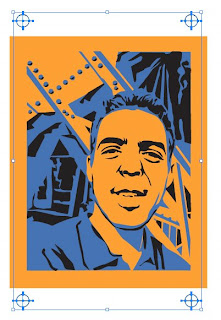
Next select your image and make all colors White.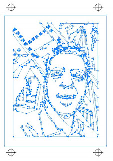
Return to the Selection Menu and select each color one at a time. Turn that color Black. I usually copy and paste each color separation into a different Layer. Remember to return your image back to white before starting a new color selection!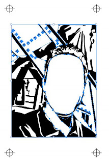
Now you’re done! As long as you keep the alignment marks in the same position, you can move the image around and print them at will.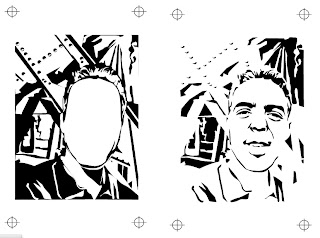
I hope you’ve enjoyed this. If you have any questions, please feel free to leave comments or drop me a line.
Be good,
--Ben

