Today’s post will be about the design principle of alignment. New designers often violate this design principle by putting text and graphics on the page wherever there happens to be room. Often this can leave a layout looking unorganized and unprofessional. By aligning objects, you can give your pages and designs a feeling of harmonious visual appeal.
The principle of alignment states that nothing should be placed on the page arbitrarily. Everything on a page should have a visual connection with something else. Following this foundation forces you to be conscious about the decisions you make.
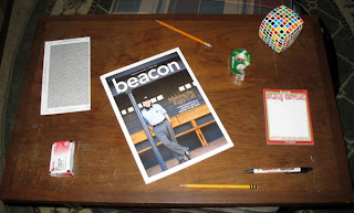
Have a look at the photo below. This is my coffee table with several random items on it. Although each item is separate and distinct; your mind is trying to connect them into a cohesive relationship. Because there is no pattern of alignment, individual elements fight with the overall composition.
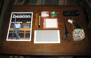
Now, when we give an alignment pattern to everything, look how organized the layout becomes. Your mind can quickly group things with a common boundary. Even when new things are added, we can quickly understand where they should go. Creating an alignment scheme is often the first step in building your design.
Business cards are a great exercise in alignment and information display. Many times I’ve been given cards like the one on the left. Amateur designers will try to fill up white space by throwing each item into an open area. In this little space, we can see three different alignment patterns (flush left, flush right, and centered). None of the elements are connected. However, by moving all the text to the right, everything becomes instantly organized. The power of this edge is what gives strength to the layout.
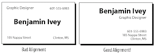

I don’t want to sound like using two different alignments is a bad thing. Alignment can be a vehicle to adding contrast. In this design, I am adding contract between the title and subtitle by using two dramatically different alignment schemes (flush left and flush right). As long as the elements are not similar, then this technique will work.
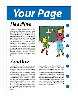 When making a layout, think of your page as a grid with vertical and horizontal guides along each element. Most design software such as Photoshop, Quark, and Illustrator offer the ability to make alignment guides and grids. If you can’t create alignment guides, then use existing items on the page. This is achieved by either aligning baselines of block text, or the edges of graphic elements.
Here’s a final example of what I mean by having a strong alignment line. In the example below we have a heading, body of text, and a picture. With the heading centered, and the body of text flush left, you can tell that I’m not very pleased with this layout. To fix this, I’m going to use the strong vertical alignment of the picture to line up my text.
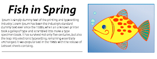 Doing this alleviates the awkward white space trapped between the text and picture. This simple design is stronger because all the elements are aligned along the same edge. Everything is cohesive an your mind is left with the sense that the text is associated with the picture.
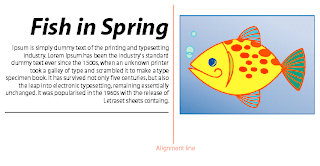 So, here’s my concussion and final thoughts… Remember that the purpose of alignment is to unify and organize your page. To make all the elements appear unified, find a strong visual alignment and stick with it. Don’t use too many alignment schemes on one page. And, most importantly, be conscious of where you place things on your layout.
In my next post, I will show you how repetition can give you designs a good reputation.
That’s all for today. You be good!
--Ben

wes Hi Ben. Just wanted to let you know that I really appreciate your blog. You have very well thought out points while not being exhaustive. It makes someone like me who is an "amateur designer" reconsider what I spend time working on. I was a Graphic Design major for one semester @ MC before my wife got pregnant with our first child. I had to drop out and work so we could feed the little guy : ). But I remember you from Lab. Keep up the good work. I will be following your lessons!
thanks.
-wesley strebeck